Tend: Brand Identity
Good news, it’s a new day in dental
With your teeth and tongue, you eat and talk. With your lips and gums, you kiss and smile. People really care about their mouths. But they don’t like going to the dentist. And for good reason. Lack of trust. A feeling of being judged. An expectation of discomfort. Dentists recognize these frustrations. They know dental isn’t working the way it should. And they, too, want to make it better. That’s why we decided to remake the entire experience, from molar to incisor.
Role: Brand, Photography, Videography Creative Direction/Senior Art Direction + Lead Design | At Tend, I was hired as their first founding creative to build their in-house brand design team, as well as help define and shape the brand visual identity from before launch through their first three studios.
The wordmark’s rounded letterforms are elegant and welcoming. The “e” is tilted to look like it’s smiling.
Nantes is the display serif. It’s used for headlines and large text. Its elegance earns trust. Founders Grotesk is used as the primary sans serif. It’s used for smaller body copy and subheadlines. Its friendly spin on rigid forms is welcoming.


The color palette is friendly and approachable. Warm, muted colors create a sense of calm. Tend Green adds authority by evoking medicine, associated with green for more than a century.
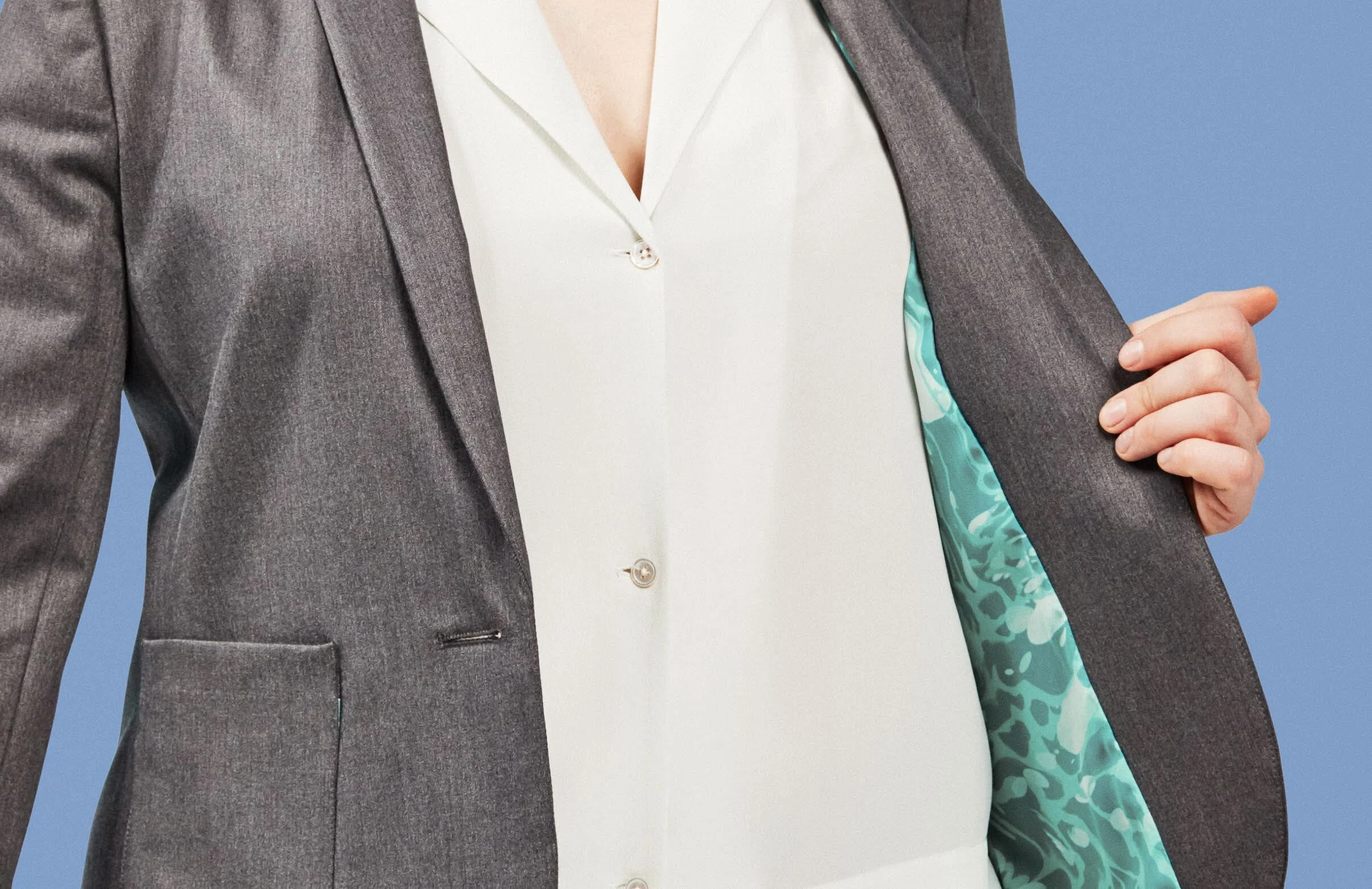
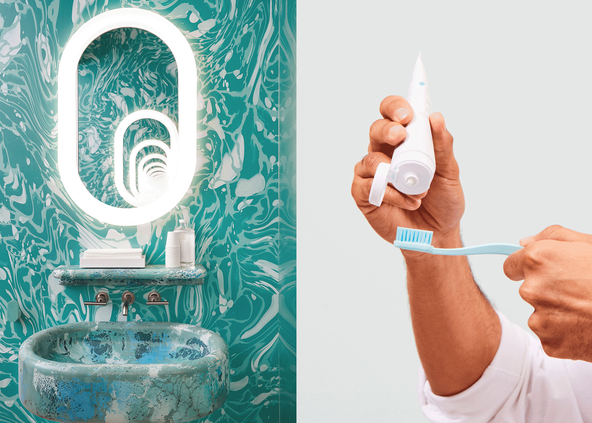
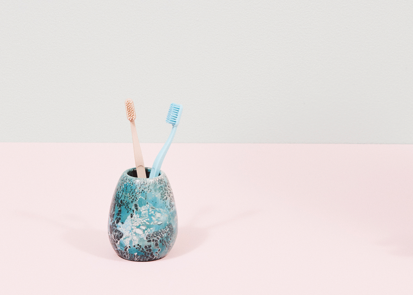
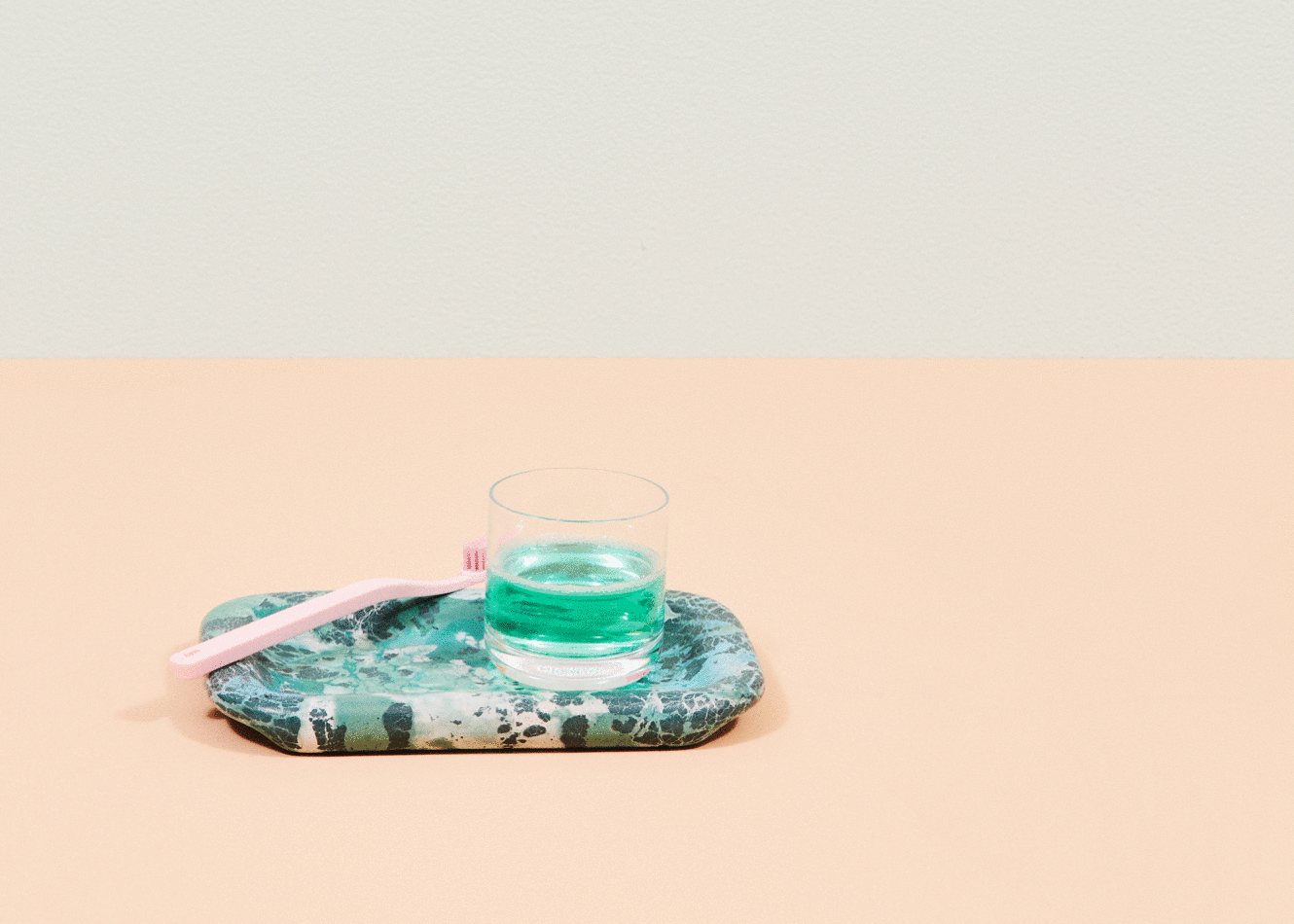
An artist commissioned pattern is inspired by brushing, swishing and swirling. It celebrates the sensory richness of everyday oral wellness routines.


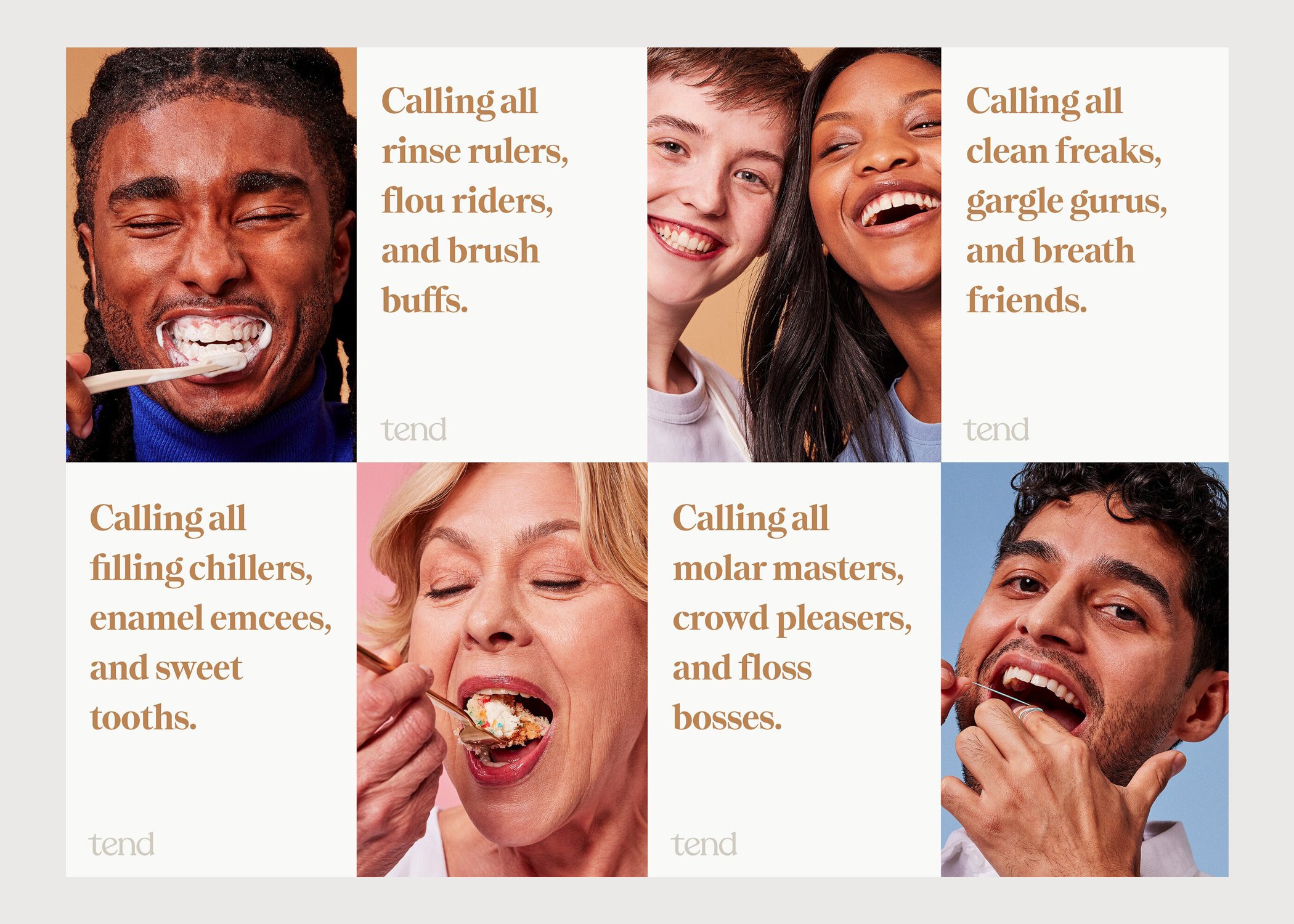
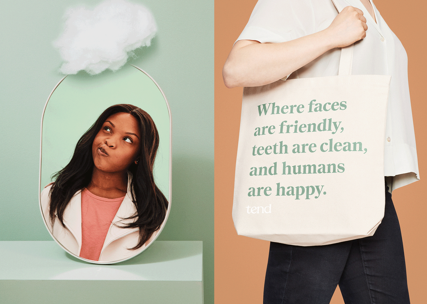
Brand imagery celebrates mouths of all kinds with zero judgment.

Photography of dentists and hygienists are shown in uniform to communicate their expertise, but also smiling and snacking on their favorite foods in a way that feels relatable. Light cream backgrounds set them apart from our bold brand imagery.


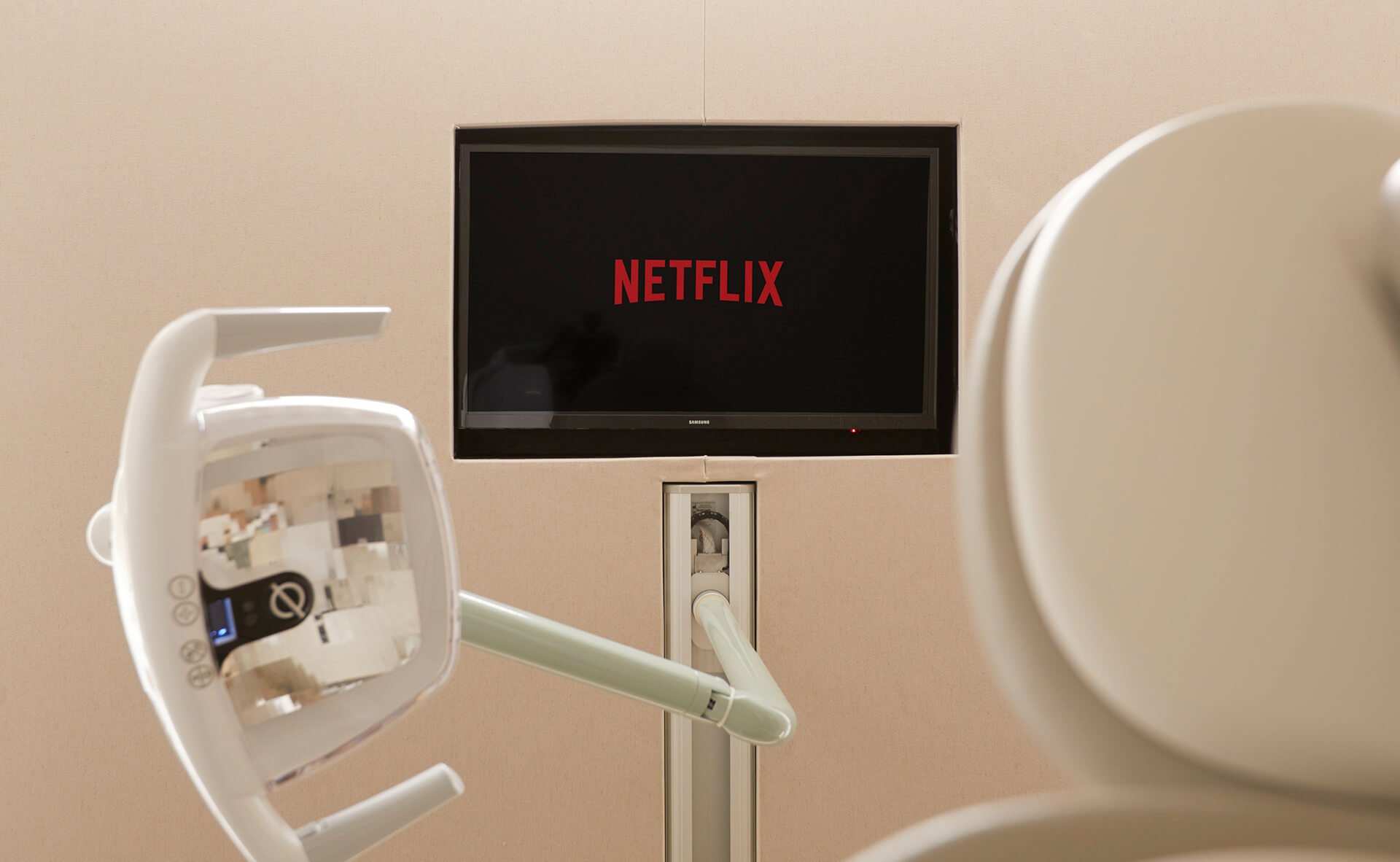
The online booking experience is easy. It builds trust and anticipation with up-front, transparent pricing, personalized preference gathering, and in-your-chair Netflix choices.
Photography of the space is shown light and bright, keeping a clean but welcoming environment. Minimally propped with florals and vases. Architectural and interior design elements are designed to ease anxiety. Green tiles with a winding, floss-like pattern. Walls with a toothpaste-like texture. Rounded, welcoming shapes. Natural light. Cafe-style tables.


The Brushery is an entirely new concept. It’s a space just for freshening up, with pattern on the walls and blue-green sinks and shelves that play off of it.

In your suite, a TV greets you by name. Then you’re shown to your “personal space.” It has a sink with hand soap and lotion, a place to hang your coat, and an outlet to charge your phone.


And before you leave, you receive goodies you’ll love.

Additional brand applications:


Learn more below about how we brought the Tend brand to life:
Outcomes: $73M raised from Seed through Series B
Awards: Red Dot Award, Tend Brand Identity, Communication Arts Design Finalist: Tend Brand Identity, ADC One Club Merit: Tend Studio Design
Role: Brand, Photography, Videography Creative Direction/Senior Art Direction + Lead Design
Collaborators: Stephan Hoefnagels (SVP of Design), Devin Kelly (Art Director/Senior Designer), Chris Jadatz (Lead Product Designer), Brendan Nowlin (Product Designer), Daniel Feldman (Designer), James Molloy (Content), Mythology (Logo mark & Studio Design Direction), Lawrence Group (Architecture), BHDM (Interior Designer), Design Ergonomics (Suite Layout), Santtu Mustonen (Pattern Artist), Brayden Olson (Brand Photography), Tory Williams (Studio Photography), Tawfik Mounayer (Uniforms), Concrete Cat (Sinks), Lukas Floss (Mirrors), Adage (Tend Fragrance)