Blue Apron: Brand Evolution
Blue Apron’s goal is to make the experience of cooking with quality produce and specialty ingredients accessible to everyone—no matter where they live or how busy they are.
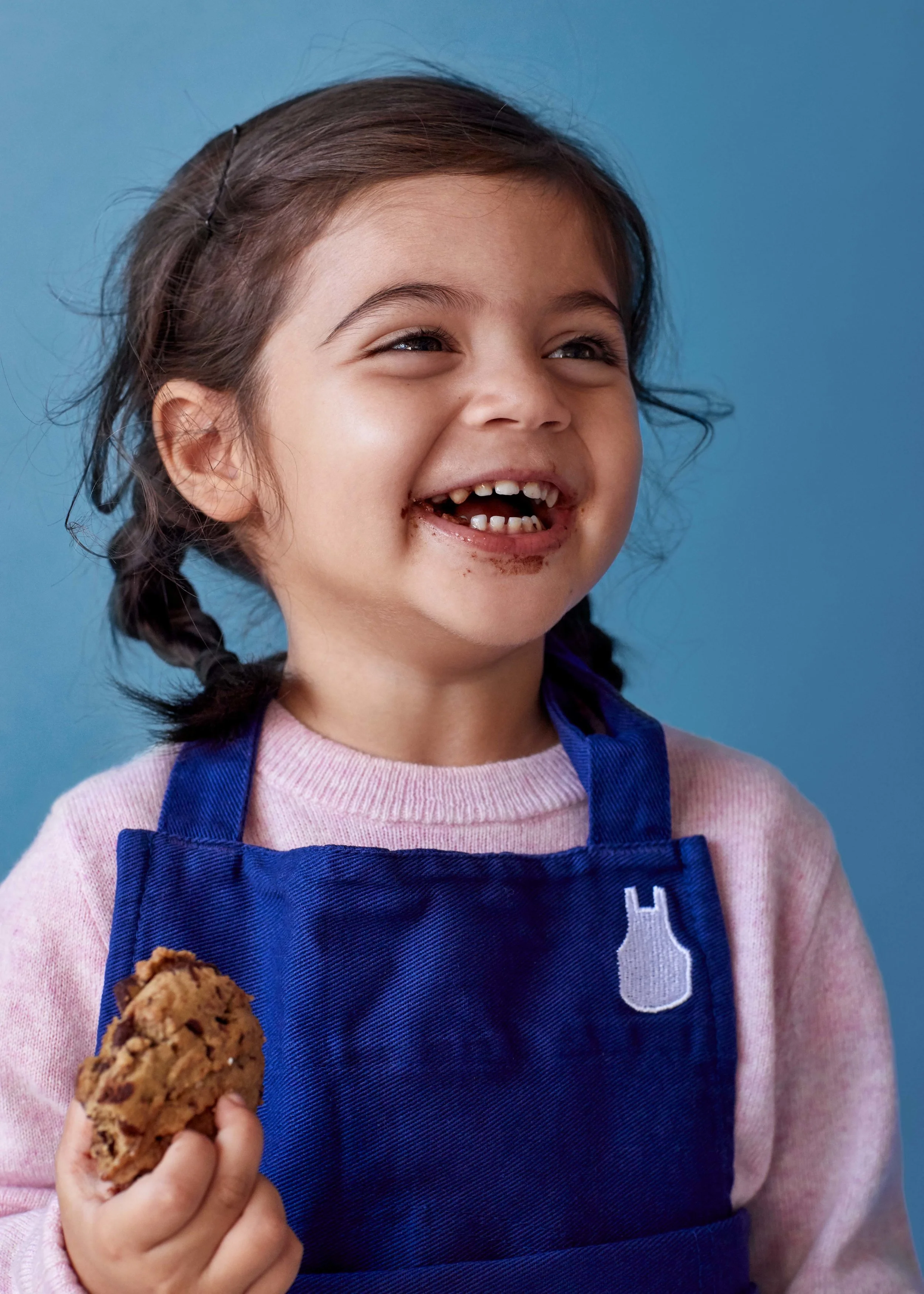
Role: Brand & Photography Creative Direction, Art Direction + Lead Design | At Blue Apron, I was hired to lead their in-house brand design team, as well as evolve their existing brand identity.

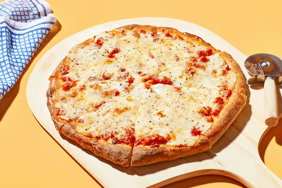
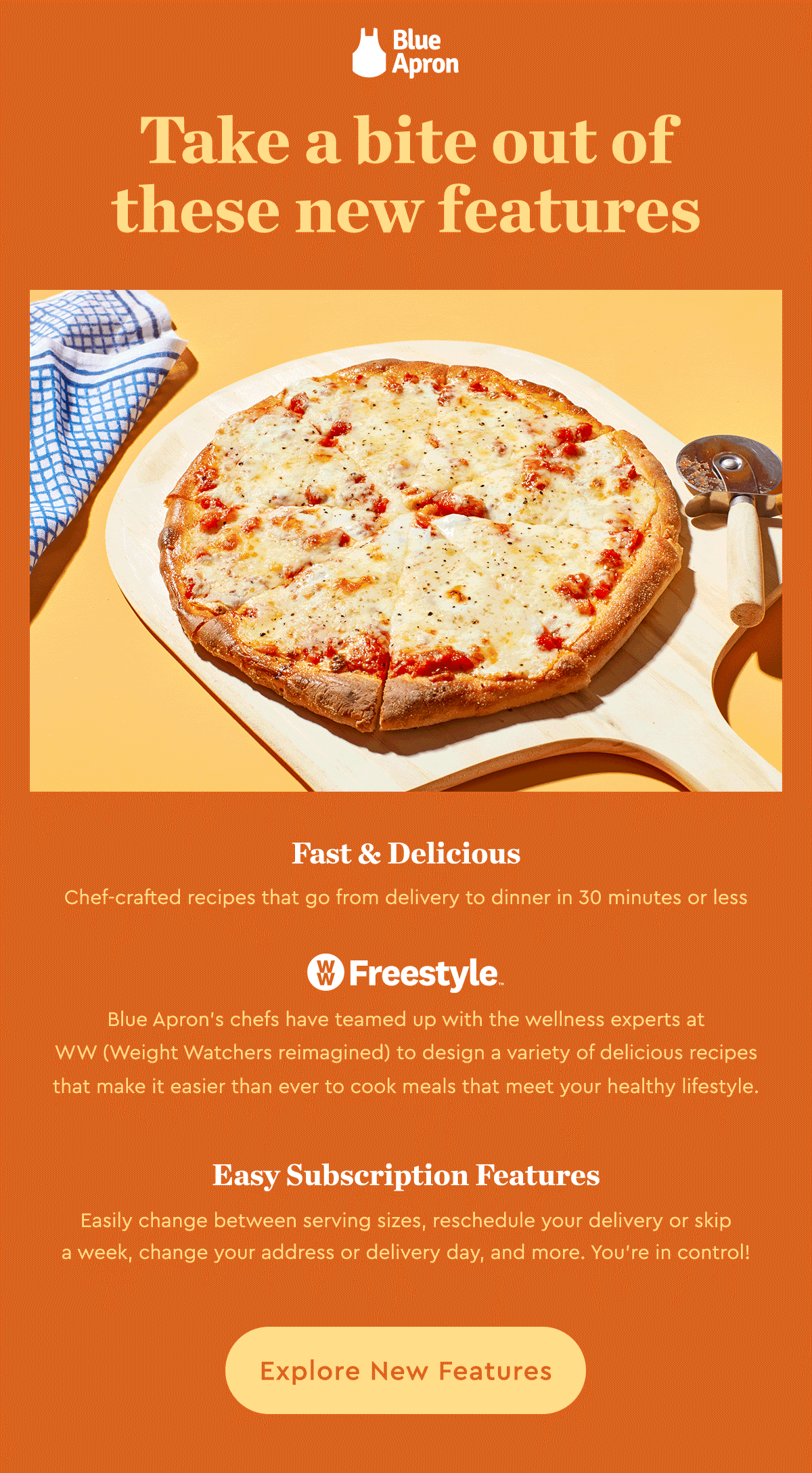
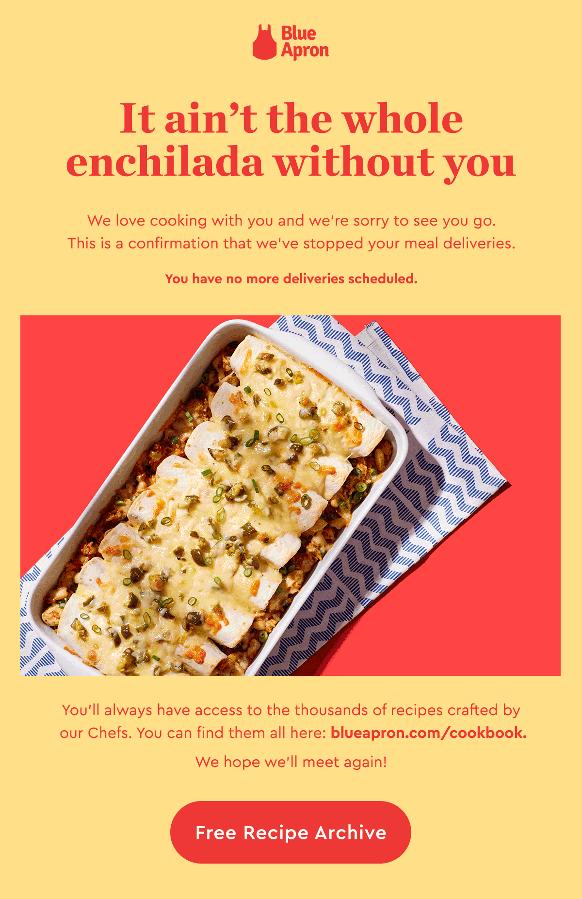
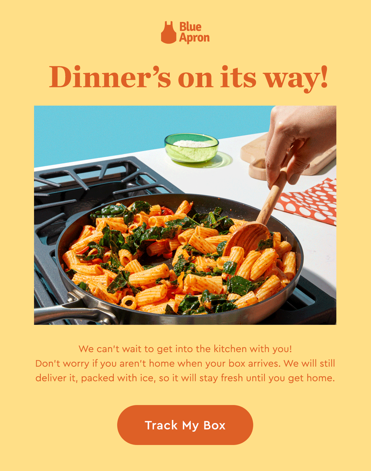
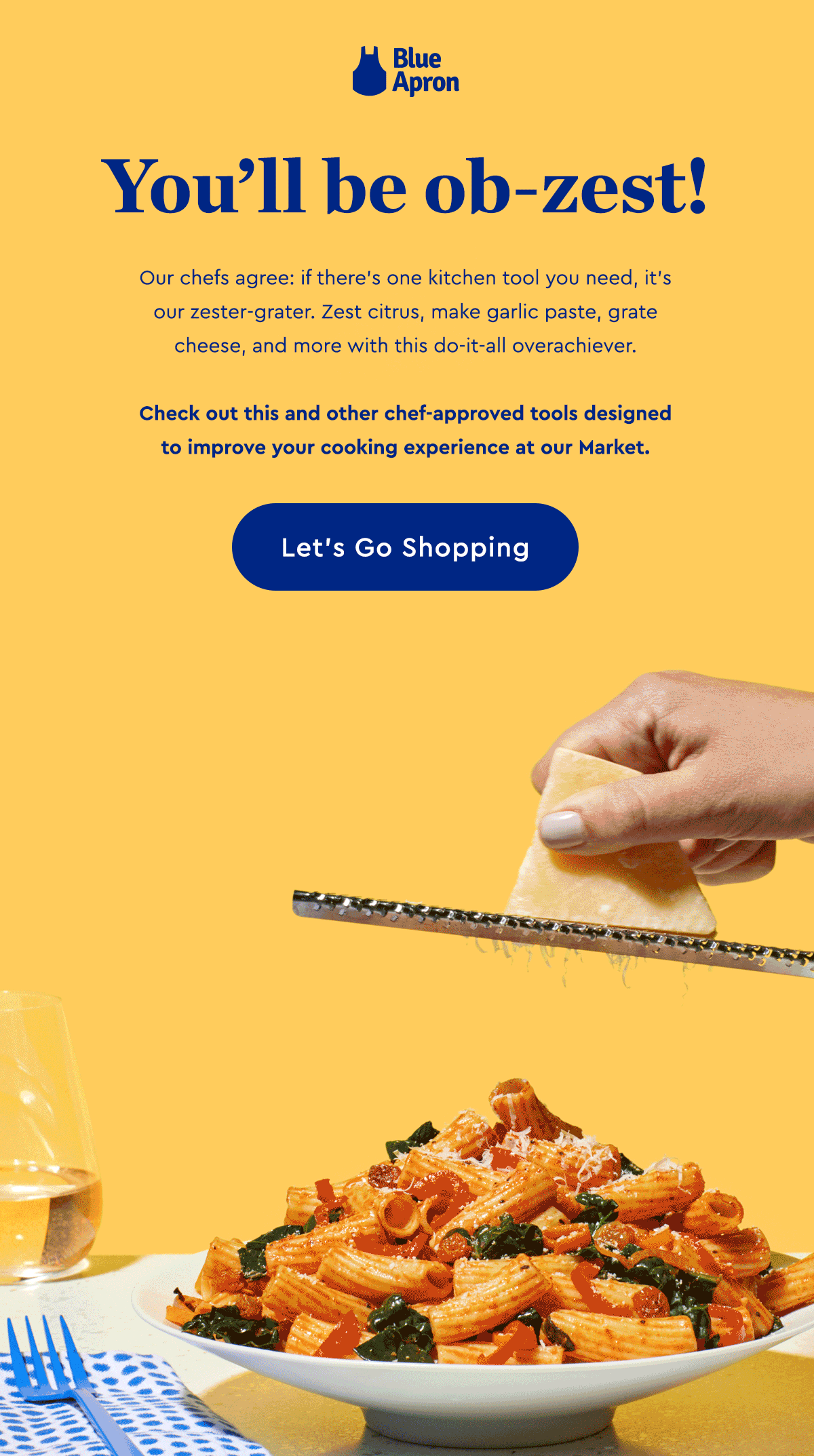
For the Blue Apron customer, seeing food in their inboxes is an everyday occurrence. The core email flows were getting lost in the shuffle. To set them apart, we departed from our normal table scapes and leaned into the taste appeal of our recipes. We shot some finger-licking, mouthwatering photography to get our customer excited for their Blue Apron journey, or even to help win them back!


The new Welcome, Abandon Cart, and Win Back series are bold in its use of typography and color. The emails are clear and concise, while the messaging speaks well to the imagery.


We also started to take risks on bolder more unique partnerships. Bob’s Burgers x Blue Apron was out of the box to some, but a perfect pair for our burger lovers.
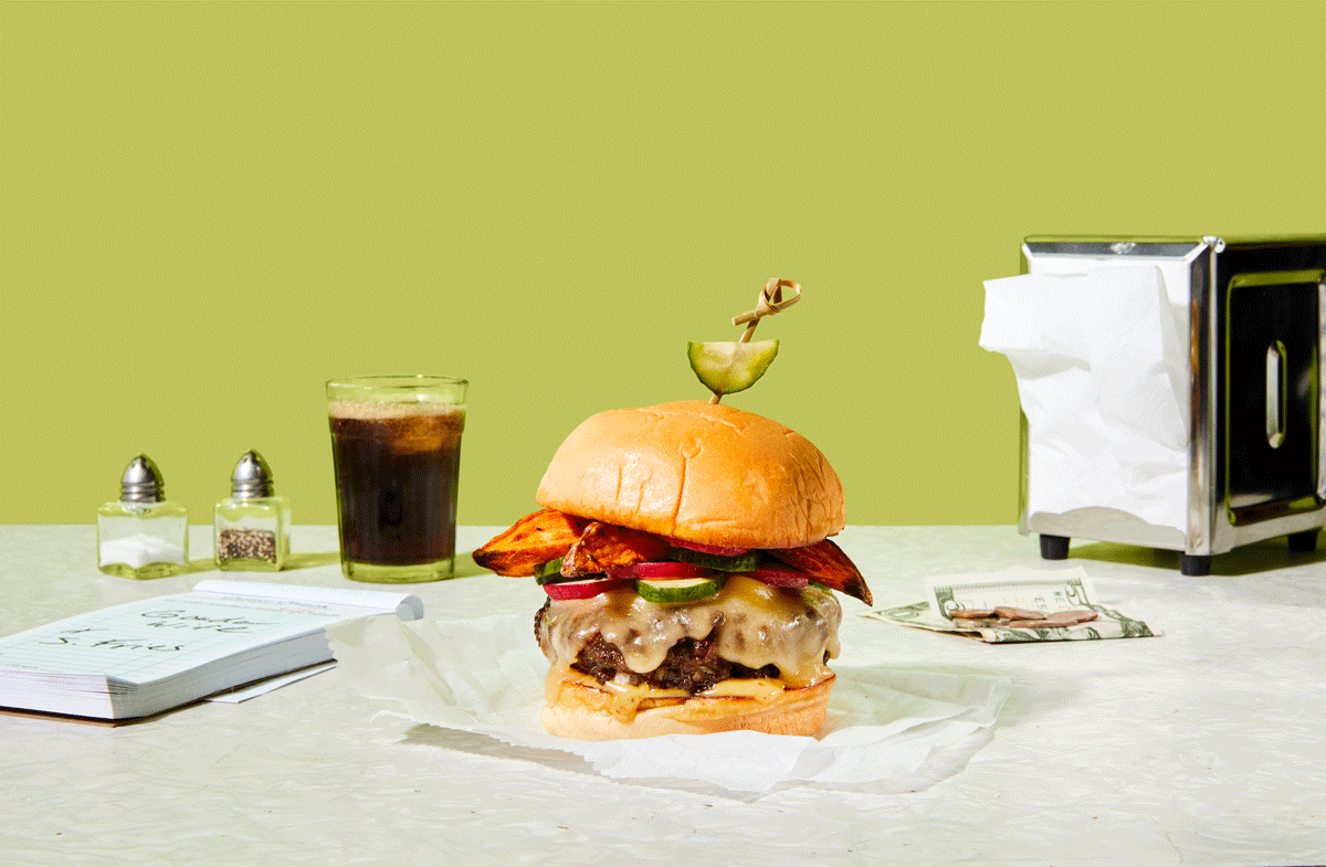

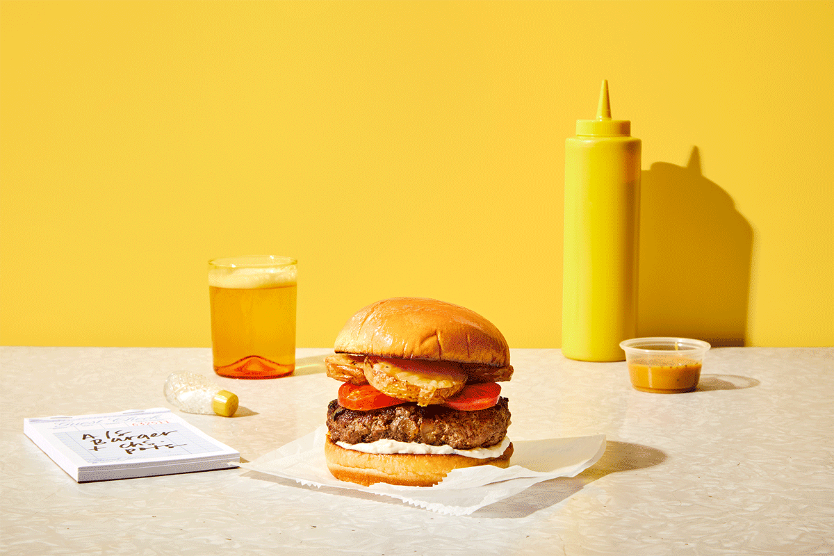


The photography bridged the gap between Bob’s Burgers cartoon world, and our reality. The palette served purpose leaning on primary colors that nod to condiments (relish, ketchup and mustard). Backgrounds and surfaces feel flat to emulate the 2D nature of cartoons. Burgers are stacked high and in motion to emulate the famous Bob’s Burgers “Burger of the day”. We even partnered with Hedley & Bennett to create a bespoke apron.


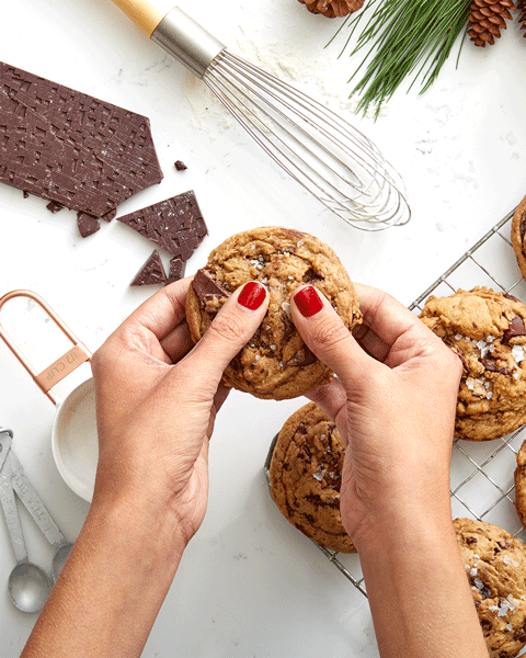
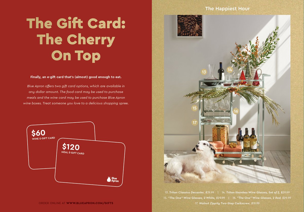
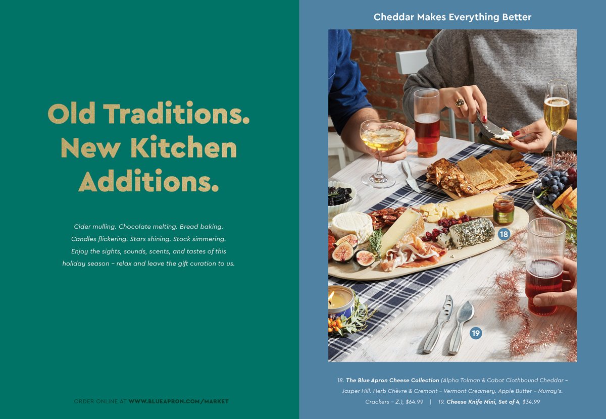
There was a strong need to update the look and feel of Holiday Gift Guides, so this year we focused on micro vs. macro imagery, tugging on your holiday senses. That delicious cookie from the oven or that fragrant hot cup of coffee.


Natural lighting and festive table scapes evoke the feeling of a family gathering or being with your loved ones. The kitchen is the heart of the home, and a place to bring people together. In our photography we want you to feel that. We even snuck in some motion for our social channels.


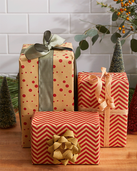
How it all came together with gold pantone finishes, large typography and flat bold color:


Role: Brand & Photography Creative Direction, Art Direction + Lead Design
Collaborators: Stephan Hoefnagels (SVP of Design), Devin Kelly (Art Director/Designer), James Molloy & Sarah Richter (Content), Rick Holbrook & Mike Krautter (Photographers), Molly Corrigan (Food Stylist), Jenna Tedesco & Sarah Vasil (Prop Stylists)